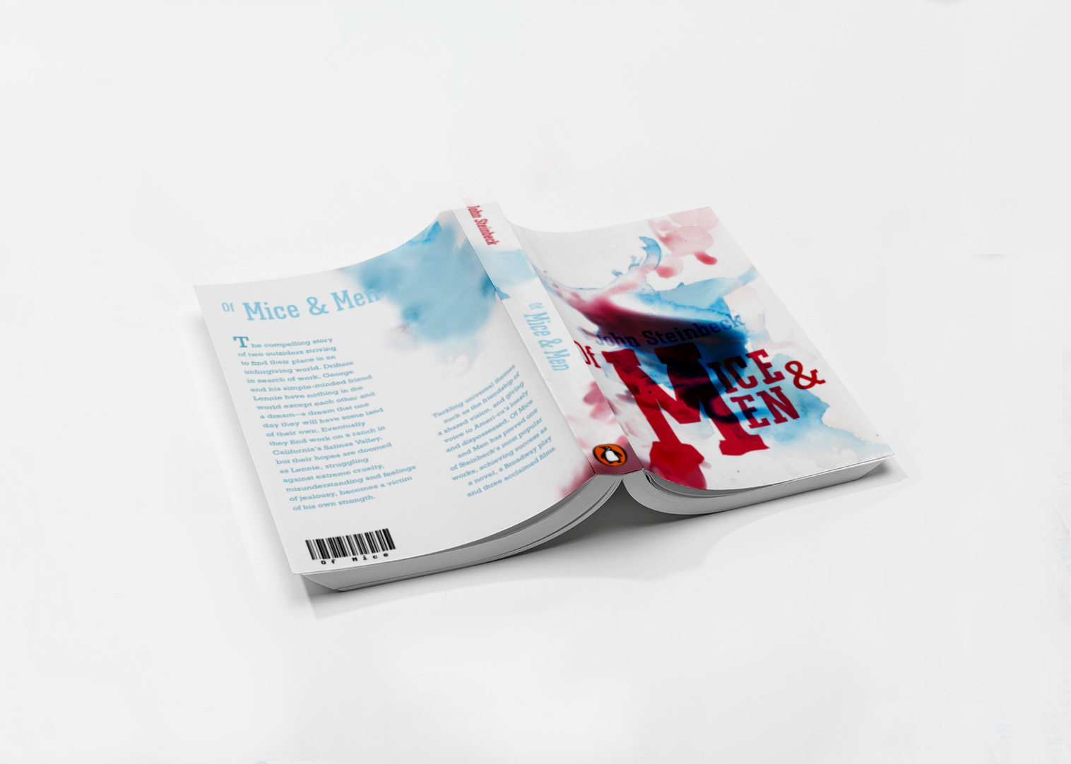
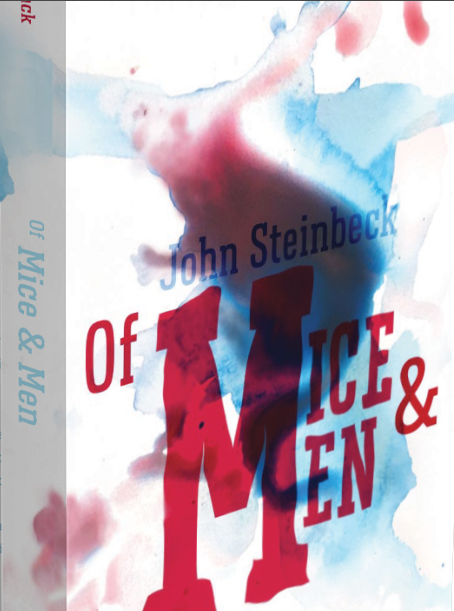
My cover for Of Mice and Men was the product of a beautiful accident! I had been experimenting with paint mixed with water, and decided to just pour a very watery mixture onto a piece of watercolor paper. I had created a pool of blue and red (representing the prominent river as well as death within the novel) that had the basic form of a mouse. After that there was a lot of refining as well as playing with type in order to get an appropriate relation between the cover image and the content to be represented on the sleeve. Though Of Mice and Men is a classic novel, I wanted to create a contemporary cover that would grab the attention of those with a more modern aesthetic. Most of my inspiration came from themes found in the book such as the imagery of the mouse, that of the river the characters often return to, as well as the gruesome death that happens a few times in the novel.

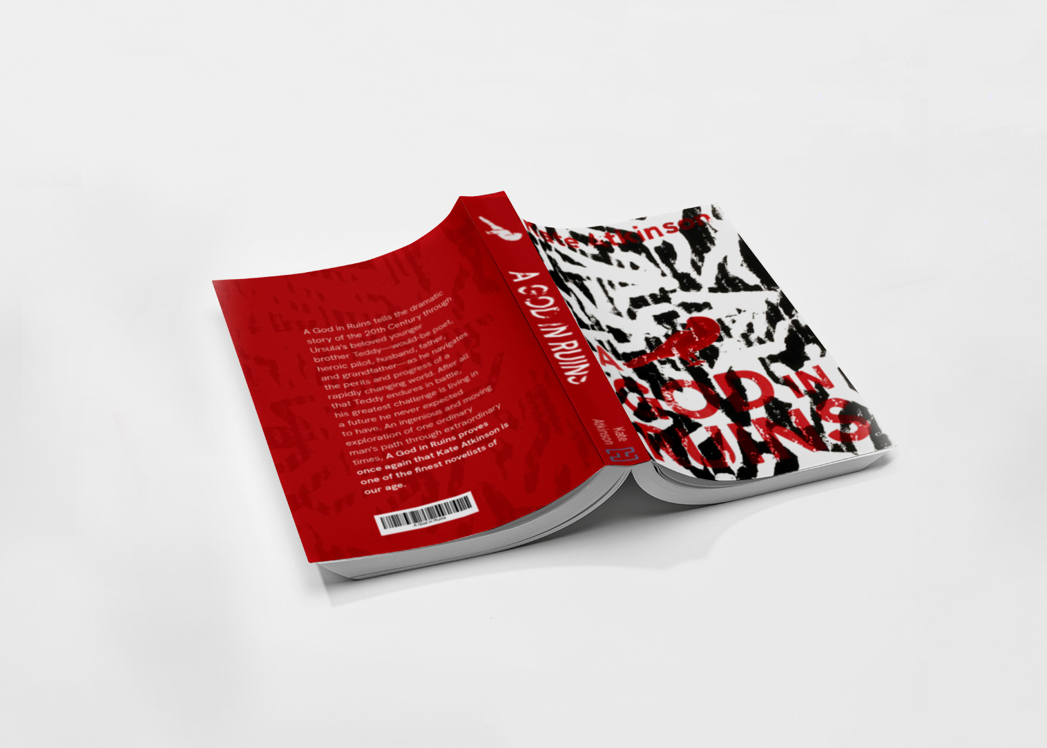
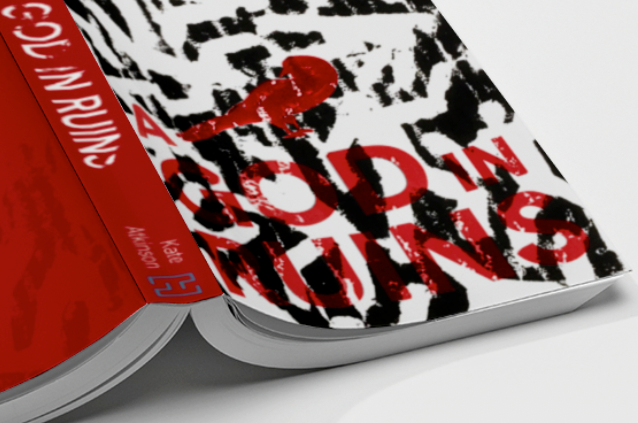
This cover for A God in Ruins by Kate Atkinson, was created through the creation of a print using abstracted human forms cut from a piece of cardboard. The major them from this book that I chose to represent was the daunting existentialism created through the act of war. The main character of the novel claims to feel like "a bird to be thrown at a wall." His reasoning for this was that, with enough birds, the wall could eventually be broken. I wanted to create a very detached feeling for this cover and cause viewers to double take. At first glance the cover appears to just be an interesting texture with no real pertinence, but in reality it is meant to represent the sacrifices made during wartime. Pairing abstracted figures with dirty red type, meant to represent bloodshed, I created this cover to give readers a sense of the depressing nature of this book.